
Brand Strategy & Identity ·
Long Island Board of REALTORS® (LIBOR)
A more professional identity. A broader sense of belonging.
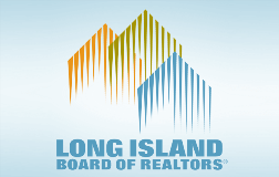
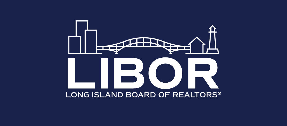
I led a comprehensive brand refresh to give LIBOR a more professional look and feel and better reflect its membership. The new logo was designed to include Queens members and represent the full region, from the city at its western end to Montauk at its eastern end.
My role: Led the refresh across visual identity, color palette, brand story, messaging and website, working with stakeholders and creative partners from strategy through launch.
Challenge, Approach & Deliverables
Modernize LIBOR’s presentation and create an identity that represented the geographic breadth of its membership.
ApproachConnect the visual identity to the people and communities LIBOR serves, then carry the refreshed look across organizational and member communications.
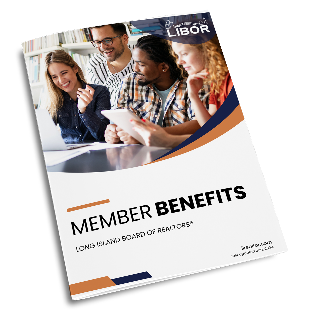
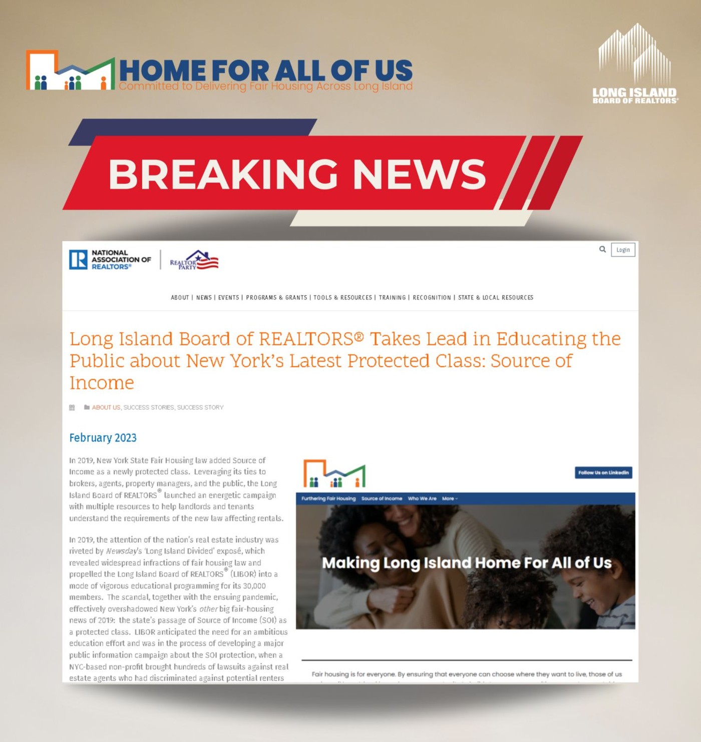
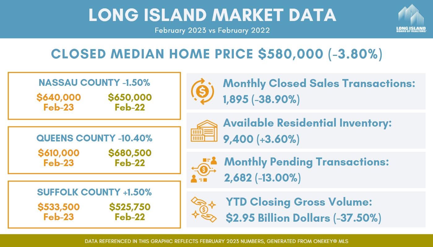
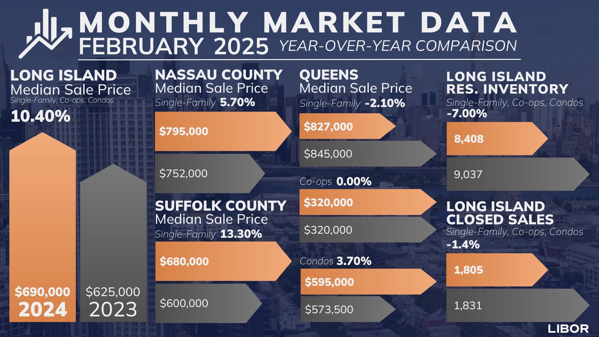
DeliverablesA refreshed logo, color palette, brand story and website, with updated applications such as the market data graphics shown here.